| Type | Class |
|---|---|
| Tags | Project: Online Classes, human-computer interaction, mooc |
Human-Computer Interaction I: Fundamentals & Design Principles (Link)
- CS6750: Human-Computer Interaction
- GTx: HCIxI
This is an online version of a graduate course at Georgia Tech, CS6750.
Section 1: Introduction to HCI
Lesson 1.1: Introduction to HCI
HCI is about humans interacting with tasks, mediated by a computer; or, alternatively, about humans and computers together interacting with tasks.
Computers are everywhere: phones, cars, tablets, video games, microwaves, and more.
Depending on the design, an interface may be more or less visible. The ideal would be an interface that totally disappears, allowing the user to feel as though she interacts with the task directly. Games are an example of such an interface, granted the user is fluent with the controls. On the other hand, for some tasks the interface is very visible, as with controlling a home theater system with multiple remote controls.
Compared to other fields
HCI is a subfield of Human Factors Engineering, and includes its own subfields, such as UI Design, UX Design, and Interaction Design. HFE is concerned with both engineering and psychology.
Compared with Human Factors Engineering, HCI is interested in only computer aspects of interaction, where HFE is interested in broader interactions, such as physical layout of non-computer objects.
User Interface Design is primarily concerned with screen interfaces, while HCI covers interfaces of other kinds as well.
HCI is about understanding user interaction with computers, while UX Design is about dictating such user interaction.
HCI involves an iterative process of using research to create designs, and applying what is learned from the use of those designs to futher research.
Lesson 1.2: Introduction to CS6750
Learning goals
- Understand the common principles in HCI
- Understand the design life cycle
- Understand current applications of HCI
Learning outcomes
- To design effective interactions between humans and computers.
By effective interactions is meant interactions that support the goal of the design. Typically this would be usability, but it may also be to support research–in which case a less usable design might be created to gain insights into its use–or to produce changed behavior in the user, such as a thermostat designed to cause the user to save energy.
Lesson 1.3: Exploring HCI
HCI is used in many areas. This lesson gives a brief overview, to give you something to think about while going through the course. The divisions below are somewhat arbitrary.
Technologies
- Virtual Reality
- Augmented Reality: Google Glass, etc.
- UbiComp (Ubiquitous Computing) and Wearables
- Robotics
- Mobile
Domains
- Special Needs: prosthetics, etc.
- Education
- Healthcare: tools to help doctors with diagnosis, patients with managing their data, fitness trackers, VR for therapy
- Security: if security isn't easy to use, people won't use it
- Games
Ideas
- Context-Sensitive Computing
- Gesture-Based Interaction
- Pen- and Touch-Based Interaction
- Information Visualization
- CSCW (Computer-Supported Cooperative Work)
- Social Computing
Section 1 Readings
- MacKenzie, I.S. (2013). Chapter 1: Historical Context. Human-Computer Interaction: An Empirical Research Perspective. (pp. 1-26). Waltham, MA: Elsevier.
- Norman, D. (2013). Chapter 1: The Psychopathology of Everyday Things. In The Design of Everyday Things: Revised and Expanded Edition. (pp. 1-36). Arizona: Basic Books.
Section 2: Design Principles and Feedback Cycles
Lesson 2.1: Introduction to Principles
HCI is about tasks, not interfaces
HCI considers the user interacting with a task, mediated by the interface–not the user interacting with the interface per se.
Tips to identify a task:
- Watch real users: don't just think about it, actually observe users in action
- Talk to the users
- Start small: look at individual actions; don't decide on the task too soon
- Abstract up: extrapolate from the small actions to the task, rather than fitting the observed actions to a preconceived idea of the task
- You are not your user
An interface is useful if it allows a user to accomplish some task, but we wish to design interfaces that are usable, not merely useful.
Three views of the user
In HCI, the user might be viewed in three ways: as a processor, as a predictor, or as a participant. Each of these suggests different requirements for the interface, and each may be evaluated using different methods.
As a processor, the user is like another computer participating in the actions, processing and responding to eevnts. The interface must be physically usable. Evaluate with quantitative studies. This view is influenced by the behaviorism school of philosophy, which is concerned only with observable behaviors and outcomes.
As a predictor, the user should understand what the results of their actions will be. The interface must make sense to the user. Evaluate with qualitative studies. This view is influenced by cognitive psychology, which is concerned with what happens inside the mind.
As a participant, the user's whole experience, including other tasks they are performing and tools they are using, should be considered. The interface should fit with the user's context. Evaluate with in situ studies. This view resembles functionalism or systems in psychology.
This processor model is helpful for optimizing existing interfaces, particularly for improved efficiency for expert users, but does not give insight into why novice users might fail.
The predictor model can target different levels of expertise, and by talking to the users, it is possible to learn about their thought processes and any misconceptions they may have. However, this kind of research is more expensive than quantitative research and is vulnerable to bias from the researchers. Additionally, it might miss complications due to context.
The participant model evaluates the interaction in a realistic context, so it gives a more complete picture of the interaction. Like the predictor model, this may be expensive and difficult to research and analyze, and its strength–the realistic context for interaction–is also a weakness, because it opens the study up to confounding factors. Additionally, since this model requires a complete interface to be available, it cannot be used during initial design.
Lesson 2.2: Feedback Cycles
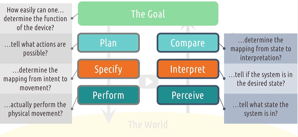
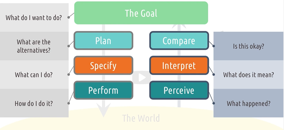
The gulf of execution
The gulf of execution is the distance between a user's goals and the actions required to realize those goals. How does the user figure out what to do to accomplish their goals? What is the distance between what the user thinks they have to do and what they actually have to do?
Five tips about the gulf of execution:
- make functions discoverable
- let the user mess around: don't have actions that cannot be undone, or will otherwise cause harm
- be consistent with other tools
- know your user
- feed forward: help users predict what the result of an action will be
The gulf of evaluation
The gulf of evaluation is the distance between the effects of those actions and the user's understanding of the results. Three components or phases of this are the interface output, the interpretation of that output, and evaluation, in light of the interpretation, of whether the goal was accomplished.
Five tips about the gulf of evaluation:
- give feedback constantly
- give feedback immediately
- match the feedback to the action: major actions give more obvious feedback that minor ones
- vary your feedback: use not merely visual, but perhaps auditory or haptic feedback
- leverage direct manipulation
Norman's Feedback Cycle Stages
Section 2 Readings
- Norman, D. A. (1986). Cognitive engineering. In D. A. Norman & S. W. Draper (Eds.) User Centered System Design: New Perspectives on Human-Computer Interaction. (pp. 32-61). Hillsdale, NJ: Lawrence Erlbaum Associates.
- Norman, D. (2013). Chapter 2: The Psychology of Everyday Actions. In The Design of Everyday Things: Revised and Expanded Edition. (pp. 37-73). Arizona: Basic Books.
Section 3: Direct Manipulation & Invisible Interfaces (Lesson 2.3)
With a direct manipulation interface, the user should feel as though they are interacting directly with the object of their task. For example, when zooming an image on a phone, it seems like you are interacting with the image itself, not an intermediate interface.
The seminal paper on direct manipulation interfaces, from 1985, is:
- Hutchins, E. L., Hollan, J. D., & Norman, D. A. (1985). Direct manipulation interfaces. Human-Computer Interaction, 1(4), 311-338.
It can be found here.
Comment
The example is given and revisited of moving files around. Following the desktop metaphor, we should expect moving files around on a computer to be similar to moving files around on a desktop. However, this insistence, I think, is itself something of a failing: there is no special reason why we should use this kind of interaction for dealing with our data. There are file systems that don't have folders, and there are systems that support tagging of files (even Windows supported this for many years, though the interface for it seems to have been de-emphasized, at least) so that they can be found without navigating a directory structure.
Actually, this is a good point: the 'files and folders' metaphor clearly begins to fail when you have folders nested in folders nested in folders ad infinitum. Sure, we could try to extend the metaphor by calling the outer folders file drawers, or cabinets, or whatever, and there's no reason why we can't understand a recursive structure here, but at that point we no longer have the interpretation "there is a folder on my desk with a group of related files in it", and instead what we seem to have is more like a directory with cross-references. It seems to me that the whole metaphor should be re-examined.
An invisible interface is one that seems to disappear–the user can forget that they are using an interface at all. This could be due to learning, such as turning the steering wheel when driving, or it could be by design.
Five tips about invisible interfaces:
- use affordances: the visual design of the interface should suggest how it is to be used
- know your user: novices and experts will have different expectations
- differentiate your user: allow both novices and experts to have good interactions
- let your interface teach: for example, display the hotkey for a function on the menu item
- talk to your user
Section 3 Readings
- Hutchins, E. L., Hollan, J. D., & Norman, D. A. (1985). Direct manipulation interfaces. Human–Computer Interaction, 1(4), 311-338.
- Ishii, H., & Ullmer, B. (1997, March). Tangible bits: towards seamless interfaces between people, bits and atoms. In Proceedings of the ACM SIGCHI Conference on Human Factors in Computing Systems (pp. 234-241). ACM.
Section 4: Human Abilities (Lesson 2.4)
Vision
Women are color blind at a rate of about 1 in 200, while men are color blind at a rate of about 1 in 12.
Memory
We will consider three kinds of memory: the working memory, the short-term memory, and the long-term memory.
Working memory
The working memory or perceptual store holds the most recent experiences and lasts less that a second.
The visuospatial sketchpad holds visual images, the phonological loop holds audio, and the episodic buffer integrates these chronologically. The three are coordinated by a central executive.
Short-term memory
Users can store four to five chunks of information at a time. These chunks can be understood as a single unit, such as a single word, as opposed to a collection of random letters.
Comment
This limit is the same one famously described in The Magical Number Seven, Plus or Minus Two, though the specific number given differs. The lecture claims that we have found that the 'true' number is really four or five. The text recommended in this course, Human-Computer Interaction: An Empirical Research Perspective, still says seven, however.
Long-term memory
The example is given of a Leitner system.
Knowledge
There are two kinds of knowledge: procedural knowledge, which is how to do something; and declarative knowledge, which is knowledge about something.
Cognitive load
Cognitive load is the amount of the brain's cognitive resources that are in use. Different tasks will require different amounts of a user's cognitive resources, and attempting to perform a task when insufficient resources are available may yield poor results. So it is important to understand the full context in which an interface will be used, in order to estimate the user's cognitive load, and to minimize the cognitive load caused by the interface.
Five tips for reducing cognitive load:
- use multiple modalities, e.g. visual and verbal
- let the modalities complement each other
- give the user control of the pace
- emphasize essential content and minimize clutter
- offload tasks: for example, if the user needs to remember something entered on a previous screen, show them what they entered
Motor system
We must be aware of how quick and precise a user can be, and we should be tolerant of errors.
Section 4 Readings
- MacKenzie, I.S. (2013). Chapter 2: The Human Factor. Human-Computer Interaction: An Empirical Research Perspective. (pp. 27-66). Waltham, MA: Elsevier.
- Kortum, P. (2008). HCI beyond the GUI: Design for haptic, speech, olfactory, and other nontraditional interfaces. Elsevier.
Section 5: Design Principles & Heuristics (Lesson 2.5)
We will consider four sets of principles for design:
- Don Norman's Six Principles – from POET
- Larry Constantine and Lucy Lockwood's Six Principles – from Usability Inspection Methods
- Jacob Nielsen's Ten Heuristics – from Software for Use
- Seven Principles of Universal Design – by Ronald Mace
For this lesson, these are merged into fifteen principles:
- Discoverability: It should be possible for the user to discover what actions are possible.
- Feedback: Error messages should be understandable for users, not only developers. Communications should be timely, informative, and useful.
- Constraints: Constrain user actions so that the user can readily determine the correct action. This can prevent incorrect user actions, rather than needing to recover from them. Norman suggests four categories of constraints: physical, cultural, semantic, and logical.
- Mapping: Items in the interface should have relationships that mimic real-world relationships of the goal space. For example, interface elements could be physically laid out corresponding to the layout of the physical objects they control.
- Consistency: Users should be able to use their existing understanding to predict how an interface will function. Follow conventions whenever it makes sense to do so.
- Affordances: The design should suggest how the interface is to be used.
- Structure: The interface should be organized purposefully, to enable users to create a good mental model.
- Simplicity: Irrelevant information should not be displayed, since it makes relevant information more difficult to spot. The design should be easy for users of all levels of skill to understand.
- Tolerance: The design should reduce the cost of errors, for example by allowing undo and redo.
- Equity: Avoid stigmatizing any users. Allow all users to have the same experience.
- Flexibility: Allow the system to accommodate individual preferences. For example, provide hotkeys for expert users as well as menu options for novices.
- Perceptibility: The user should be able to keep track of the state of the system.
- Ease: "The design can be used efficiently and comfortably and with a minimum of fatigue." – Ronald Mace
- Comfort: "Appropriate size and space is provided for approach, reach, manipulation, and use regardless of user's body size, posture, or mobility." – Ronald Mace
- Documentation: Documentation should be concise, practical, and searchable.
There are other principles in a variety of works:
Dix, Finlay, Abowd, and Beale proposed three categories of principles: learnability for how easily a new user can grasp an interface, flexibility for how many ways an interface can be used, and robustness for how well an interface gives feedback and recovers from errors.
In Human-Computer Interaction.
Jill Gerhardt-Powals has a list of principles for cognitive engineering, aimed especially at reducing cognitive load. Her list is in particularly useful applications for data processing and visualization.
In "Cognitive Engineering Principles for Enhancing Human-Computer Performance".
In "The Humane Interface", Jef Raskin outline some additional revolutionary design rules. I wouldn't necessarily advocate following them, but they're interesting to see a very different approach to things.
In "Computer Graphics Principles and Practice", Jim Foley and others give some principles that apply specifically to 2D and 3D computer graphics.
Susan Weinschenk and Dean Barker have a set of guidelines that provide an even more holistic view of interface design, including things like linguistic and cultural sensitivity, tempo and pace, and domain clarity.
In Designing Effective Speech Interfaces.
Section 5 Readings
- Norman, D. (2013). Chapter 5: Human Error? No, Bad Design. In The Design of Everyday Things: Revised and Expanded Edition. (pp. 162-216). Arizona: Basic Books.
- Nielsen, J., & Molich, R. (1990, March). Heuristic evaluation of user interfaces. In Proceedings of the SIGCHI Conference on Human Factors in Computing Systems (pp. 249-256). ACM.
- Norman, D. A. (1986). Cognitive engineering. User Centered System Design, 31, 61.
- Story, M. F. (1998). Maximizing usability: the principles of universal design. Assistive Technology, 10(1), 4-12.
| Name | Role |
|---|---|
| David Joyner | Instructor |
| edX | Publisher |
Relations
| Relation | Sources |
|---|---|
| Led to |
Comment
This idea seems related to the concept in Computers as Theatre.