Microsoft Word 5.0 (DOS) & Microsoft Word 1.1 (Windows)
Like the last post, this one is a double feature. Sadly, unlike WordPerfect 5.1, which was released for both DOS and Windows with the same version number, MS Word used different numbers for is DOS and Windows version. So I've arbitrarily picked a DOS and Windows version each released at around the same time as WordPerfect 5.1 to look at.

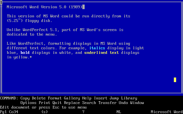
On first glance, MS Word 5.0 for DOS, released in 1989, looks fairly similar to WordPerfect 5.1. It's a big blue screen with some status info at the bottom. But that's not quite all. In Word, the toolbar is constantly visible at the bottom, taking up several lines, and the text entry area is surrounded by a box. This box isn't just for show, though: you can choose to split the view into many different windows, which each may contain different documents. In practice, splitting the screen into more than two windows is probably not very useful, since the available space will be tiny, but it's still a nice feature.
As for the toolbar at the bottom, though, that's a waste of space. They should have just devoted a bit of space on the bottom line to say "Menu: Esc", or something, instead. I give them half credit for the interface.

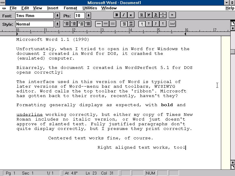
MS Word 1.1 for Windows, released in 1990, looks more like what we're familiar with from Word. With the standard menu-and-toolbar interface, it's a fairly usable word processor, even if it has some quirks in the display.
Word 1.1 does have a big flaw, though: when I tried to open in Word 1.1 the document I made in Word for DOS, it actually crashed DOSBox! It did successfully open the document I made in WordPerfect 5.1, though... I think I'm going to have to give this point to WordPerfect.

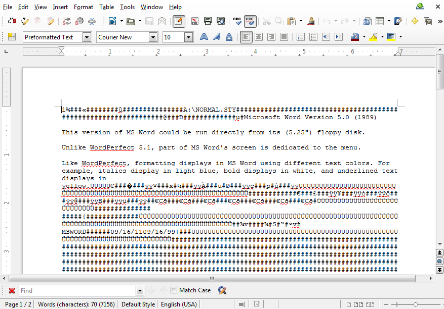
Furthermore, opening the documents I made in either the DOS or Windows version of Word in Libreoffice yields a bunch of garbage. I know that technically it's not Word's fault if a piece of software written a quarter century later doesn't properly import its documents, but it's still a sad lack of longevity.
In short, 1989's version of MS Word had some neat tricks with the multi-window interface, but I prefer the minimalist (and less-space-wasting) WordPerfect interface. WordPerfect 5.1 for Windows looks better than Word 1.1 for Windows, too, though both were apparently rather buggy, so they'll be winning no awards: above all, software must work, after all.
WordPerfect was still king of word processors at this point, but over the course of the 90s, its crown would be stolen by Word, leaving the once-mighty application little more than an also-ran, relegated to filling out the OEM software stack of budget PCs.